博客头像设置
添加头像
打开主题的_config.yml文件,在avatar处添加主题下/source/images/里的自己添加的图片
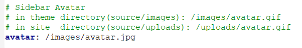
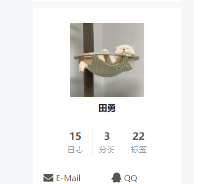
刷新成功显示
头像圆角并旋转
我就不搞这功能了,看着头晕
打开主题下的 source\css_common\components\sidebar\sidebar-author.styl文件(不同版本和不同主题可能路径有些许不同,添加下面的代码即可
.site-author-image {
display: block;
margin: 0 auto;
padding: $site-author-image-padding;
max-width: $site-author-image-width;
height: $site-author-image-height;
border: $site-author-image-border-width solid $site-author-image-border-color;
/* 头像圆形 */
  border-radius: 80px;
  -webkit-border-radius: 80px;
  -moz-border-radius: 80px;
  box-shadow: inset 0 -1px 0 #333sf;
  /* 设置循环动画 [animation: (play)动画名称 (2s)动画播放时长单位秒或微秒 (ase-out)动画播放的速度曲线为以低速结束
(1s)等待1秒然后开始动画 (1)动画播放次数(infinite为循环播放) ]*/
/* 鼠标经过头像旋转360度 */
  -webkit-transition: -webkit-transform 1.0s ease-out;
  -moz-transition: -moz-transform 1.0s ease-out;
  transition: transform 1.0s ease-out;
}
img:hover {
  /* 鼠标经过停止头像旋转
-webkit-animation-play-state:paused;
animation-play-state:paused;*/
  /* 鼠标经过头像旋转360度 */
  -webkit-transform: rotateZ(360deg);
  -moz-transform: rotateZ(360deg);
  transform: rotateZ(360deg);
}
/* Z 轴旋转动画 */
@-webkit-keyframes play {
0% {
-webkit-transform: rotateZ(0deg);
}
100% {
-webkit-transform: rotateZ(-360deg);
}}@-moz-keyframes play {
0% {
-moz-transform: rotateZ(0deg);
}
100% {
-moz-transform: rotateZ(-360deg);
}}@keyframes play {
0% {
transform: rotateZ(0deg);
}
100% {
transform: rotateZ(-360deg);
}}
他人生最大的失败就是听从于懒惰、怯懦与害羞。